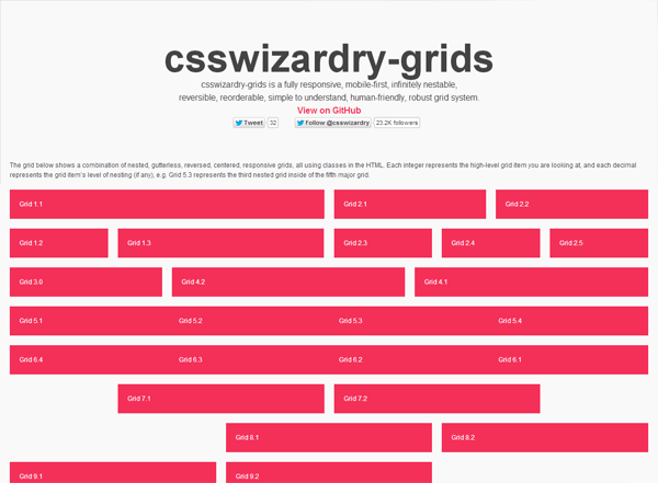
csswizardry-grids
This responsive web design grid system’s approach is to go about designing web layouts mobile first. Similar to the Neat philosophy discussed earlier, if you’re concerned about populating your markup with an overabundance of presentational CSS classes, then you have the option to uses Sass’s @extend feature with csswizardry-grids.
The grid below shows a combination of nested, gutterless, reversed, centered, responsive grids, all using classes in the HTML. Each integer represents the high-level grid item you are looking at, and each decimal represents the grid item’s level of nesting (if any), e.g. Grid 5.3 represents the third nested grid inside of the fifth major grid.

